Discussion Forum (Archived)
Guest
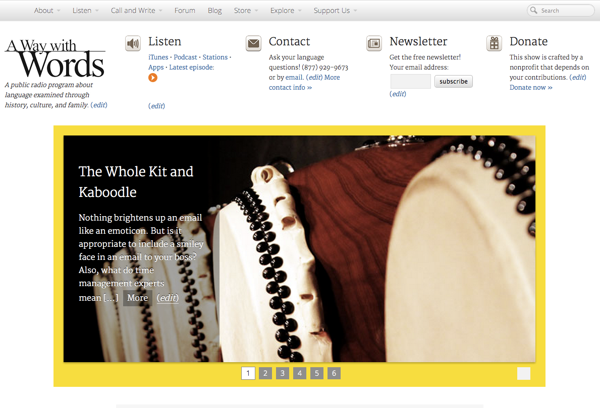
After months of work, here it is: the new A Way with Words website.
We took a lot of things into account in the renovation, but the biggest category of considerations has been what you, our listeners and visitors, needed. We not only gave you what you asked for, we gave you a whole lot more to enhance your experience of the site. Let us know what you think.
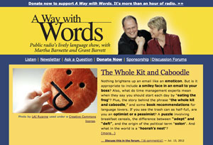
Compare the new and old sites side by side:
What we've done:
We revamped the look and feel of the site.
• We discarded most of the shocking yellow and blue and went for something a bit more like the printed page with a few yellow highlights here and there.
• We took our photo off the header (Grant calls it "the walrus and the princess"). If you want to see what Martha and Grant look like, there are photos on the About page.
• You'll also see slightly larger text everywhere, which is easier to read on desktops and mobile devices.
• We're also now using more and larger images, we have revamped the look of the discussion forum (and updated its software), and we have made hundreds of tweaks throughout the entire site.
We've made it easier to find what you want.
• There's now a site-wide search button in the upper right corner of every page. If that's not good enough, you can also use a Google Custom Search, which lets you use the usual Google operators and options.
• We've also added a new floating navigation bar to the top of the page that stays visible as you scroll and browse. With it, we've tried to strike a balance between utility and unobtrusiveness. It contains links to everything you might want to know or do.
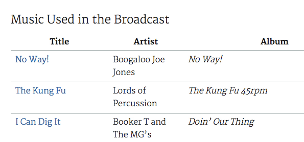
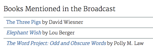
Every episode page is being overhauled.
• We're still working our way through the back catalog of episodes, but the last ten or so episodes already show immense improvements.
• On each episode page, we now include a list of music broadcast during the episode. This is a direct response to the very large amount of email we receive complimenting our editor and engineer, Tim Felten, on his music choices (he has a funky, gritty soul).
• We also include a list of books mentioned in the episode. That's in response to the frequent messages we get from people who were driving or cooking or otherwise occupied when we mentioned a book worth remembering.
• We are creating individual pages for each segment of each show, and linking between them and their parent episodes. This means, for example, that if you only want to browse the word-puzzle segments, you can. Of course, it also makes it easier to re-listen to any segment of a show without having to guess where it starts in the full episode file.
• We're also now using the SoundCloud player for in-browser playback of episodes and segments. SoundCloud is like YouTube for audio, with a host of social features, such as the ability to link comments to specific moments in the audio. Try it! Here's a live player:
[soundcloud url="http://api.soundcloud.com/tracks/52750838" params="auto_play=false&show_artwork=false&color=ff7700" width="100%" height="80" iframe="true" /]
• We've turned commenting on for all posts on this site and linked them to the forum, so the same conversation can be held and read in both places. This is provisional. We think the anti-spam tools we have will stop the flood of spam comments but if it turns out not to be the case, we may have to disable commenting on stories again. (Spammers haven't changed their ways in the five years since we first launched the site, alas.)
We've made the website work far better on mobile.
• When we first launched our website in 2007, mobile streaming and listening weren't something we had to take into account. We went from less than 1% of our website traffic being on mobile in 2007 to almost 25% on mobile in 2012. Now we can't not take mobile into account.
• To make the site nice to look at on small screens, we're using a "responsive" framework — PageLines — that neatly changes its configuration depending upon the width of the browser. Images resize automatically. Boxes reflow. The menu across the top turns into a simple drop-down. You can try it now by dragging the right edge of your browser to the left.
• We're also using an episode player at the top of every screen so mobile users don't have to hunt around to hear the latest episode.
• We've had them for quite a while, but now we're drawing attention to our apps for iOS, Android, and Blackberry. You can click those links or always find them in the Listen menu above. Our apps are not free but they're inexpensive and our nonprofit makes a small commission off of each sale.
Even more language content has been added.
• Not only are we giving each segment its own page, we've also added in all the back issues of our newsletter, and we're integrating more than 18,000 records from Grant's Double-Tongued Dictionary. You can find it in the navigation menu at Dictionary under Explore. Read more about the dictionary and what it means for A Way with Words to be its new home.
• We've also fired up a blog. You'll not only find our newsletters posted in full there, and our episode announcements, but new entries in our Dictionary, and brand-new follow-ups to calls we take on the show, featuring listener responses and new information.
Browse just the newsletters here.
• We've also completely rewritten every regular page on the site. We recommend trying all the menu items in the navigation bar above, starting with the About page.
More social media.
Another thing that wasn't very widespread in 2007 was social media. Facebook, Twitter, and SoundCloud had yet to gain their place as important social tools.
So, we've made it easier to like and share our content using a variety of social media services. Look for this bar below every post:
![]()
Of course, that's self-serving, too. We want people to share our stuff!
But there's another aspect to it: we want you to be able to find us where you want us. If you prefer to find out about new episodes on Twitter, great. Facebook? Fine. We aim to make that easier.
Adding to the bottom line.
This show is funded by a diversity of income streams of varying sizes, and we've long known that our listeners wanted swag or merchandise.
• So, we've created a Zazzle affiliate store, where you can buy logoed items of the usual sorts: coffee mugs, tote bags, T-shirts, what have you. Every sale there nets our nonprofit a small commission. We'll be adding new items as they occur to us — and if you have ideas for T-shirts we'd love to hear about them!
• Similarly, we've set up an Amazon bookstore, stocking it books we know and like, including many of the titles we talk about on the show. There's also an Amazon music section, featuring awesome tunes picked by the aforementioned Tim Felten, our engineer and editor, including the same songs you hear during our broadcasts.
• Additionally, when we mention a book or song in the text of one of our site posts, we'll link using our Amazon affiliate code. If you click on the link and buy on the spot, that, too, will generate a small commission for our nonprofit.
A note on compatibility.
We have tried to make the new site backward-compatible with older browsers as much as possible. However, if you are using an older browser, some features will not work as we intend.
If you can, do try to upgrade to the very latest browser. We recommend Google Chrome. Your Internet experience will be improved not just here but across the entire web.
Here's a very thorough but friendly explanation of why it's a good idea.
We're not done.
You'll see more tweaks and changes over the coming weeks.
For one thing, we still have a long list of to-dos of the hopeful and if-time-allows kind.
For another, we'll be updating all of our old episode pages to have the features described above.
But more importantly, we'll be paying attention to how the new design is working, we'll be reading and listening to your feedback, and we'll be fixing or revising where needed.
All responses welcomed, as always.
Your radio pals from the Nerd Club of the Air,
 &
& 
Martha Barnette and Grant Barrett
co-hosts of A Way with Words
Photo by Rick Harris. Used under a Creative Commons license.
I sent this to the email link for feedback in Grant's initial post to this thread, but I'll also post my feedback here, just in case other members want to voice their agreement or disagreement ...
***
Hi Grant & Martha,
I wasn't sure if I should add comments at the end of your lengthy "New Website Format" thread or do it this way, but I see no feedback there in close to 24 hours so I'll use this email link from that thread.
1. You obviously spent a lot of time on this revision. I like the fact that the Double-Tongued Dictionary is now a part of this site. Thanks for all the hard work!
2. When I first posted in the new site, I missed that captcha at the bottom. I have my own blog and recently turned off comments for the same reason. Even with the Spam Free Wordpress plugin, the spammers were still finding a way to do their thing. So I feel your pain, and understand the need for that captcha. Thanks for at least making it an easy one to use. Any chance established forum members could be "grandfathered in" and not have to go through that step for the first post after login?
3. When a page changes or reloads, there's a LOT of stuff loading, and the scrolling is jerky until the whole page is loaded. And I have high-speed ADSL. Probably nothing that can be done about that. Content is content, and there's really nothing unnecessary on the pages, but I thought I'd mention that.
4. The font color is just a bit too light for my eyes. Especially in quoted block text. I mean, I can read it, but it just seems too light. Don't know what others are saying. My two cents.
Anyway, thanks again for all the work. Overall ... I'd give it a 9 outa 10.
Thanks, much appreciated. Are these comments about the whole site or just the forums?
I've been mulling over darkening the font everywhere, too, so it's good to have another vote for that.
Once you've made a post on the newly updated forum, you should be grandfathered in from then on out, even after another login. Let me know if that's not happening for you and I will look into it.
There are some tweaks left to do on the site that will speed it up and there is auto-tagging going on, too. That said, we're constantly looking for ways to make the site faster. Expect that to get better over time. We may also look into one of the free content delivery networks to see if that's worth the effort.
Grant, I see a drop-down box with new/updated topics and just under that "(0) topics with unread posts". Still don't see any indication of where I've posted. I realize this is all new and I'm sure there's lots that will be tweaked and played with.
I've been wandering around the website. The changes look good! I can't imagine how much work it's been.
I'll second Heimhenge that the font color is too light. It's a little hard to read. I haven't noticed any problems in the scrolling, though.
Well, since you're taking votes. (Mine count only regarding the forum, since that's all I ever look at—I'm a word nerd.) I wouldn't say the font is too light for easy reading; but it's light enough that I'd probably like it slightly darker. Sounds like you're heading in that direction anyway, so no need to belabor it.
Obviously you spent a lot of time debating fonts, so it's a shame to find fault with them now that you're committed. But I do a lot of writing so I'm opinionated. I much prefer a typeface for which my PC has true italics, not just a version of italic that's manufactured by slanting the roman typeface to the right (thus spoiling the kerning). Sometimes I have to look around for one of those, but most PCs have Times and Century Schoolbook installed these days, and where Century Schoolbook is missing the Georgia works well. I don't mind that the draft font is sans serif, but whatever you're using has the same difficulty. And your "content" font—I couldn't find its name, but it looks like a sort of proportional flavor of Courier—is too blocky for my taste.
It's too big for my taste, too, but I've always had high-resolution eyes so I don't think my vote should count for much in that area. Now that I'm in my late 50s my eyesight (corrected for ordinary presbyopia) is degraded to something in the neighborhood of 20-17, but I still crank up the resolution on my monitor as high as it'll go. I'll be down to 20-20 soon, I'm sure, and then I'll be glad you paid no attention to my complaints.
I do like the anti-bot measure: simple, easy to understand, not time-consuming to operate. No doubt an enterprising spammer could write a way around it, but it would require more work than spamming a single site would repay, so I expect it'll be perfectly adequate. Did you think that up, or has it become more or less standard these days? I've never encountered it before.
As for the other features, I haven't explored enough to know what else has changed. I guess I could do with less white space.
I have already darkened the body font substantially. Are you saying it's still too light?
it looks like a sort of proportional flavor of Courier
Really?! It shouldn't. Can you post a screen grab of what you're seeing? And tell me the OS, browser, and version?
The serif font we're using is Merriweather, a Google font, at font-weight 300, which is "book" size:
http://www.google.com/webfonts#UsePlace:use/Collection:Merriweather
If Merriweather doesn't work in your browser, it should fall back to your browser's default serif.
The anti-bot measure is not common but it comes with Simple Press, the forum software we use. It's pretty clever, right?
I think that the color should be a bit darker, like what I'm seeing right now while writing this, and so much the better if a background color is added as well.
BTW, thanks for your works on the site.
[Added]
I don't know why the timing does not match with the current time. I was writing at about 4:05 pm, but my post showed 4:37 am!
Well, I have to retract my comment about the new font contrast being fine. In the regular text of a thread, it is. But go to any thread where someone uses a block quote, and you'll see those are still tough to read. Maybe use a different font for the block quotes (if possible)?
Unlike Bob, I don't mind the extra "white space." Better that than filling it with clutter and increasing the page load time. That "white space" is created by Grant's choice of sidebar width in the page layout. I don't think it's possible to only extend that sidebar down part of the page, so if you need the sidebar for those links and social media buttons at the top of this thread, you're gonna get some white space down below.
The only way to reduce the "white space" would be to go to a smaller font, which would reduce the height of the page. Well, either that or reduce the width of the sidebar. And you might be able to reduce it a bit.
Martha Barnette
Grant Barrett
Grant Barrett
1 Guest(s)